How to create a textbox with a scrollbar

•March 2, 2017 • Comments Off on How to create a textbox with a scrollbar

Sometimes on you will need to include a lot of text on your page. This could crowd your page really fast and make the content less readable. One way to solve this problem is to create text boxes with a scrollbar, so that the large amount of text will be concealed unless you hover above the text box and scroll. There’s two ways to achieve this!

  1. The first is using inline style. My code looked something like this:

screen-shot-2017-03-02-at-10-37-59-am

Just make sure you have enough text so that the scrollbar can function.

But of course, you can play with the float, margins, width, height, and positioning of your text box.

2. The second method is using an internal style sheet. Mine looked like this:

screen-shot-2017-03-02-at-10-40-26-am

and the corresponding code later looked like this: screen-shot-2017-03-02-at-10-43-01-am

Once again, you can play with the elements of the text box to yield different visual results, including fonts and colors!

Both of these methods, yielded a page that looked like this:

screen-shot-2017-03-02-at-10-38-35-am

And there you go!

DIY Transparent Hover Effect Over Images

•February 10, 2017 • Comments Off on DIY Transparent Hover Effect Over Images

We live in a world full of aesthetics, so why not work towards making your webpage more aesthetically pleasing, keep reading to learn how to make your images on your webpage have a transparent hover effect.

First let’s put an image on your webpage using the tag. Remember that the tag is empty so it does not need a closing tag

So your code for your image should look like this:

Screen Shot 2017-02-10 at 12.35.05 AM.png

If your image is a url, it should be inserted as

and do not forget to add the height and width as listed above.

Once you’ve finished that your website should look something similar to this…Screen Shot 2017-02-10 at 12.35.26 AM.png

Now that is done, it’s time to add the transparent hover effect. Go back into your coding nests to add this CSS effect

In order to do this we need to alter the opacity of the image, the opacity of the image seen above is at 1. Let’s cut it in half and change the opacity to .5. For a stronger effect go lower the opacity of an image can be altered from 1.0-0.0

Opacity is changed in the under

insert img {

                                                 opacity: 0.5;

                                                   filter: alpha opacity=50; /* For IE8 and earlier */

                                                 }

Your coding should look like this

Screen Shot 2017-02-10 at 1.09.50 AM.png

And your webpage should look like this

Screen Shot 2017-02-10 at 12.58.41 AM.png

Now thats done its time to move on to the final step, the Hover effect.

In img you are going to remain in the <head> under <style> and insert another img{ under the first one 

               img:hover {

                                                 opacity: 1.0;

                                                   filter: alpha opacity=100; /* For IE8 and earlier */

                                                 }

Your coding should look like this

Screen Shot 2017-02-10 at 1.10.48 AM.png

And we’re done! Your webpage should look like this. A realtime video would be perfect to show you the end result in motion. But I have not gotten that far yet. So, try it out yourself!

Screen Shot 2017-02-10 at 1.12.56 AM.pngScreen Shot 2017-02-10 at 1.13.04 AM.png

Have You Designed Your Page Layout?

•February 7, 2017 • Comments Off on Have You Designed Your Page Layout?

When it comes to making a new website, one might hesitate about where to start… The first question that comes to my mind is: How would I arrange my page? Where should I put this, this… and this?

Then I paid attention to some of my favorite Web (home) pages and found some similarities within their page layout/arrangements!

1. If You Love a Concise Homepage: One Large Picture and Smaller Grids Beneath

In many websites, there is a small, concise but clear navigation bar at top of the page, followed by a very large banner picture with several pictures/icons of categories not so equally distributed underneath it.

In this way, your web page is filled in with deliberately selected pictures, instead of boring subtitles.

In the example of Ssense, although the background is white/transparent, the selection of pictures add vivid colors to the overall web page, making the audience relaxed and happy:)).

WechatIMG2.jpeg

Farfetch, a website that shares mutual audiences group with Ssense, looks pretty similar to Ssense, with navigation bar (and alert) on top of the page, followed by the large banner picture. However, in this case, the banner picture is much wider that almost filled in your screen, leaving less space and attention to other pictorial contents. I guess this depends on how much you want your audiences’ attention to be distributed.

wechatimg4

Such type of layout seems to be widely used in fashion clothing websites. The concise arrangement creates a sense of “high-endness” to the viewers.

2. For a Concise Homepage, You Can Also Try a Full Screen Photo.

fresh-one-page-designs-36

This is the LinkedIn Monitor Page in 2014. Although this page no longer exists… I found this picture online and really enjoyed it.

I think this could be widely used in our class projects. The full screen pictorial creates whatever atmosphere for the viewers without distracting the viewers from the highly concentrated words in the middle. We can introduce our project ideas in this homepage and let the viewer have an idea just at the first glance without further movements.

3.For More Informative Pages, It Might Be Nice to Have Grids Equally Distributed.

The example is Farfetch’s editorial page. It wants the audiences to pay (almost) equal attention to different topics and pick their interests.


WechatIMG5.jpeg

4. Even More Informative…

I always enjoyed reading articles on the New York Times website. With the newspaper-like layout, their webpages are just as informative as they could be.

WechatIMG4.jpeg

This page is also distributed by grids. However, each grid is filled out by headlines and smaller briefs. The font usage is also deliberate crucial in terms of highlighting specific words that might interest you, “Journalism that matters” for instance. The super small pictures attached to the small columns just seem like an icon here. However, they definitely add some colors and vividness into the page.


Continue reading ‘Have You Designed Your Page Layout?’

Add Style and Links to Your Web Page

•February 7, 2017 • Comments Off on Add Style and Links to Your Web Page

Interactive media and videos are an important part of online and digital media. In blogs and websites, when customers start clicking through things that interest them, they are brought to other web pages that relate to the things they like, and that is how you can find yourself spending hours “surfing the web.” Here are some steps for creating a visually pleasing, interactive web page.

Step 1: Background Color 

It is important to have a visually pleasing web page! You can do this in a couple of ways. I like to start off with the background color of my page. To do this you can use this outline:

<body style=”background-color:color;”>

Luckily, the W3 schools has aScreen Shot 2017-02-06 at 9.34.07 PM.png list of references for the different colors that you can make the background. For example, if you want a dark fuschia- type color, you can use the tag”darkorchid”. screen-shot-2017-02-06-at-9-30-43-pm

There are a large variety of colors to chose from such as powder blue, cyan, misty rose, and more!

Step 2: Inserting Pictures

Pictures are one of the best ways to catch an audience’s attention! Inserting pictures is *pretty* easy. In order to insert a picture, you  must use the layout : <img src=”url” alt=”some_text” style=”width:width;height:height;”>.

For example, if I was making a website about how to plan the perfect party, and I wanted to add a picture of some cake inspirations, I could use this layout in order to insert the pictures of the different kinds of cakes…

screen-shot-2017-02-06-at-11-05-35-pmscreen-shot-2017-02-06-at-11-05-50-pm

Step 3: Hyperlinks

By adding hyperlinks, a person can actually interact with the web page- and expand their web surfing antics! For example, if someone was looking at the cake options, and decided that they wanted to learn how to make it, they could click on the link and find out how to make the cake! To learn how to add the hyperlink, lets take a look at the unicorn cake as an example. Adding a link is actually extremely easy and can be done so using the <a> tag. The layout for this tag would be <a href=”url“>link text</a>. So, if I wanted to add a hyper link TO the picture, I would use this:

<a href=”default.asp”>
<img src=”url” alt=”othername” style=”width: height: ;”>
</a>

screen-shot-2017-02-07-at-12-55-27-amScreen Shot 2017-02-07 at 12.55.48 AM.png

So there you go! Now you can continue to play around and make your own visually attractive and interactive web page!

I am still struggling at this whole computer savvy thing but I hope you enjoy this little tutorial 🙂

How to photos make photos the same size and line up- in one shot!

•February 7, 2017 • 3 Comments

Style….. just style.

So, I was having trouble with the layout of my website. The photos that I found on the internet were all different sizes, shapes, and jumbled all over the place.

I went to pay James a visit during his office hours on the 7th floor earlier last week, and he showed me the ropes about HTML and CSS.

My problem: 

screen-shot-2017-02-06-at-5-46-16-pm

Screen Shot 2017-02-06 at 5.46.28 PM.png

So with the help of James, I learn a little about about STYLE!

Inside of the <head>, you insert a <style> and inside you put a “img { width:50%; Height:50%; text-align:left; }

These simple tags inside the <head> tag determine the size and alignment of your photos. this saves you a lot of time between you don’t have to individually change all of the setting of the photos.

In other words, “the percentages represent all of your images (so if you change it to 45% then all of your images on your site become 45%). The “Text-align:left; determines the position of your photos (if you change it to center, every image on your page will become centered).

screen-shot-2017-02-06-at-5-52-12-pmscreen-shot-2017-02-06-at-5-52-31-pmscreen-shot-2017-02-06-at-5-52-37-pm

So you go back jumbled and disorganized to perfectly aligned and beautiful! See below!!

screen-shot-2017-02-06-at-5-54-05-pmscreen-shot-2017-02-06-at-5-49-54-pm

First and foremost, I will like to thank god, my wife and kids, my parents, and everyone who believed in me.

-Mike

How to add a favicon to your site

•February 6, 2017 • 2 Comments

A favicon is the little icon that shows in the tab of a webpage.

screen-shot-2017-02-06-at-9-15-31-pm

The circled icon is a favicon.

Before you add a favicon to your site, you need find a suitable image. After you find an image you want to use, you need to crop the image into a square because most favicons are 16 by 16 or 32 by 32 pixels large. There are many programs you can use to crop your image but you can use MS Paint for Windows or the preview editor for Mac will do just fine. To make a square selection, simply hold down the shift key while selecting the area of the image to crop.

After you’ve cropped your image, you can either resize it manually or use a service such as favicon generator to resize your image. I use favicon generator because it lets you upload an image and it generates versions of common favicon sizes for you to download. After you have resized or downloaded your image, place the image into your web folder.

Insert the following code into the <head> section of your html document.

<link href=”media/favicon.png” rel=”icon” type=”image/x-icon” />

screen-shot-2017-02-06-at-9-40-16-pm

The line in red displays your site’s favicon.

The link href should refer to the relative file path and name of your icon. In this case, my icon is in a folder named “media” in my web folder and my icon is named “favicon” with the .png file extension. After you specify the location of your icon in the tag, your site should display an icon in the tab of your browser!


Creating an Image-Friendly, Interactive Table

•February 6, 2017 • 10 Comments

By Leonard Santos

There are many reasons to have tables on a website; they’re useful for organizing information and they can be great visual guides to conveying a point across. However, I think they can also be used as a fun way to comprehensively compare items, so here’s a guide on how to combine some of the current skills I’ve learned so far to create the most comprehensive tables ever.

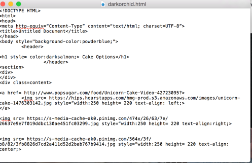
Here’s a screengrab of the final product (showcasing three of my favorite modern artists: Carly Rae Jepsen, Lady Gaga, and Beyonce):

Screen Shot 2017-02-06 at 1.40.08 AM.png

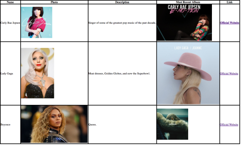
As you can see, not only did I have to make a table, but I also had to put images within it and links! This is especially helpful when creating visual comparisons between different items and providing quick access to additional information found on other links.

Step 1: Let’s begin first by creating the actual table part of the table. An HTML table is defined using a <table> tag (which is super shocking), with each table row defined by the <tr> tag. If we want to make all of the categories I put above, the code should look a little like this:

Screen Shot 2017-02-06 at 1.43.10 AM.png

And the site should look like this:

Screen Shot 2017-02-06 at 1.44.00 AM.png

Step 2: As you can probably notice, there are no borders on the table, and it looks a lot more than a navigational header than the header for a table. To solve this, we’re going to use the CSS border property in order to get some divisional lines between our headers. Using the <style> tag, make the html look like this:

Screen Shot 2017-02-06 at 1.48.02 AM.png

And your site look like this:

Screen Shot 2017-02-06 at 1.48.38 AM.png

Step 3: Now that the header is completely finished, it’s time to begin working on the actual contents of the table! To input table data, just continue using the <tr> tag whenever you start working on a new row the <td> tag when you want to put data into the row in question. To clarify, put any words or information you want to include within the table cell between the <td> tags!

To fill in the space for the moment, let’s input all of the data with no images or links (we’ll get to that later, I promise).

At this point, the code should look like this:

Screen Shot 2017-02-06 at 1.52.58 AM.png

And the site:Screen Shot 2017-02-06 at 1.52.45 AM.png

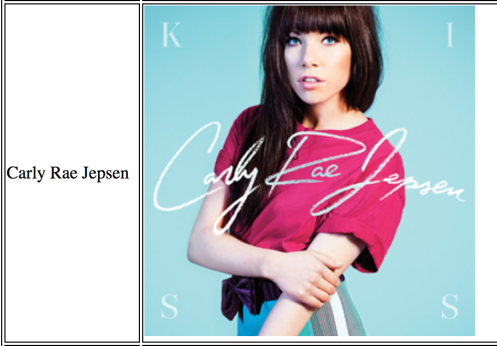
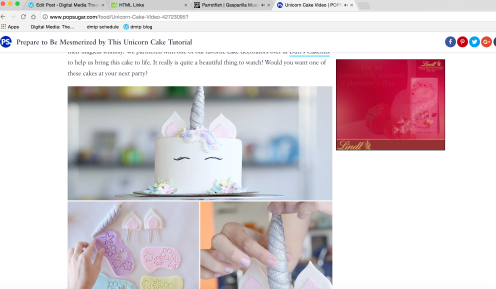
Step 4: So here’s where the normal table tutorial ends and we begin adding the fun stuff within the table! Beginning with the photos, we have to use the <img> tag in order to insert images into the table. To do this, simply look up an image that you want to insert and copy the URL of the image down. After that, use src=”url” and just put the url in! Here’s an example of what that would look like in the code:

Screen Shot 2017-02-06 at 2.00.17 AM.png

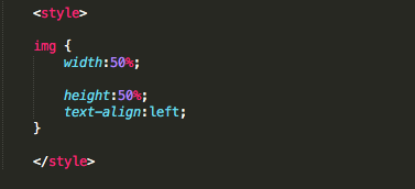
You might notice that it says “width” and “height” in the code. Not surprisingly, those help define the width and height of the image. Here’s what it looks like on the site:

Screen Shot 2017-02-06 at 2.01.43 AM.png

Step 5: If we now fill in all of the blanks where it says “Photo”, we can now use that same exact code in the HTML to fill the entire table with code! It can now look like this:

Screen Shot 2017-02-06 at 2.03.38 AM.png

And the site looks like this:

Screen Shot 2017-02-06 at 2.04.35 AM.png

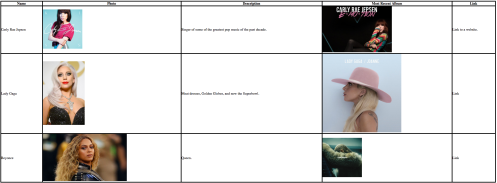
Step 6: Finally, it’s time to add those links to the end of each row. It’s actually fairly similar to how we put images into the table, but instead of image urls, we’re looking for the urls to these artists websites! In order to do that, we must use the <a> tag. If we use Carly for this example, the specific code would look like this:

Screen Shot 2017-02-06 at 2.08.11 AM.png

In this, the <td> tag defines that the link is the cell data, while the <a> tag defines what the link is. The words found outside of the URL, “Official Website”, actually acts as the hyperlink that will take a user straight from the table to website if clicked on.

That section now looks like this:

Screen Shot 2017-02-06 at 2.09.57 AM.png

And if we apply it to the entire table, here’s the final code:

Screen Shot 2017-02-06 at 2.11.12 AM.png

And here’s your final product!

Screen Shot 2017-02-06 at 2.12.07 AM.png

As you can see, you’ve taken what could’ve been a normal, boring text-ridden table and have made an image friendly, interactive source of information instead!

And that’s it! Best of luck with your table making, and try to listen to these great artists if you have the chance!

Adding a GIF to Your Website

•February 6, 2017 • 1 Comment

Although adding a gif to your website may not be crucial it is still a fun way to spice up your website. Gifs create a relatable aspect to any sort of communication. Adding a gif could further engage a viewer of your website and add some cute flourish.

Adding a gif is not complicated. There are two easy ways that one can add a gif into their HTML5. The website Giphy provides hundreds and hundreds of great gifs on their website. To make using their gifs easier they provide a link to use specifically for HTML5.

Adding a GIF from personal folder. 

  • Step 1:  You can find a gif almost anywhere, when you come across one that you like and think is useful for the future save it into a folder and make sure to save it as a Graphics Interchangeable Format (GIF)screen-shot-2017-02-06-at-12-58-58-pm
  • Step 2: The code for adding a gif is similar to adding an image. Simply write a line of code that looks similar to inserting a photo. Instead of adding “photo.jpg” make sure you add “movingpicture.gif”. The code would be <img src=”movingpicture.gif”>screen-shot-2017-02-06-at-1-05-05-pm
  • Step3: Once you’ve added your gif you can then start playing around with it and add height and width like you would for an image.

Adding a GIF from Giphy.

  • Step  1: Giphy makes using their GIFs incredibly easy. Once you find the GIF you want to use scroll to the bottom of the GIF and you will find a ‘share’ tab. Next to that tab there is an ‘advanced’ tab. In the ‘Advanced’ tab there is a list of links. Select the HTML5 link and copy it. screen-shot-2017-02-06-at-12-55-50-pm
  • A sign will flash at the top of the screen saying ‘Copied to Your Clipboard’. You can now add it to your website. The coding for this would be <iframe src=”GIF URL”> and then again add height and width to your specifications. The iframe tag is used to display your gif in your website. Since it comes from the website, Giphy, the iframe tag allows you to use the source url to display the gif. Screen Shot 2017-02-06 at 1.11.22 PM.pngAnd thats all there is to it! Have fun!

How to Add a Drop Cap

•February 6, 2017 • Comments Off on How to Add a Drop Cap

Do you want to look fancy in HTML but you’ve only just started learning how to code and the cool, complicated stuff is too intimidating? If you’re a sucker for a good drop cap here’s what you want to do to add this feature to your site:

  1. Open DreamWeaver
  2. To add a drop cap to the first letter of a paragraph, first make sure to code the <style> tagscreen-shot-2017-02-06-at-10-47-51-am
  3. Then on a new line, type p::first-letter {
  4. Start a new line, and if you would like the drop cap to be a different color, add color:, then look up the color code for the shade you want to use on the htmlcolorcodes.com website
  5. Start a new line again to manage the size of the drop cap with the font-size: tagscreen-shot-2017-02-06-at-10-49-15-am
  6. Then type your paragraph on a new line below and voila! You’ve successfully added a drop cap!screen-shot-2017-02-06-at-10-49-46-am

HTML DIY Tutorial: How to Make a Cover Page (How to Make a Clickable Full-Page Image)

•February 6, 2017 • 5 Comments

Your website is a journey, a process, an exploration. If what you’re looking for is to slow down the pace, to set the tone before a viewer dives into your site, perhaps a cover page is the introduction you need. Essentially what you are going to do is establishing a local link between two webpages in your website—a full-page sized image as your cover page, which will link to your homepage.

  1. Start with a simple, new TextEdit (or whatever plain text editor you prefer) file. Fill in the standard HTML header code, as shown below. In the <head> section, include a title for this webpage, which is what will show up on the tab when it is opened. Create a <body> section. Don’t forget to close all tags.Screen Shot 2017-02-06 at 9.08.55 AM.jpg
  2. To make the initial link is very simple. In the body section, start the <a> tag, which indicates that the information inputted next will be a hyperlink. The href attribute is used to define where the link leads to. There are many ways to reference the destination of your link, this case simply uses the complete URL of the website. The text that serves as the physical part of the link (the part you click) is placed in between the <a> and </a> tags, “Click to Enter,” or whatever you like. Always remember to close every tag!                                                                                       Screen Shot 2017-02-06 at 9.43.44 AM.jpg
  3. Since additional styles are going to be applied to this link, an extra step of assigning an “id” to this link is needed. Simply add the id attribute and give it an id name, I used “bg,” as in background.Screen Shot 2017-02-06 at 4.54.13 PM.jpg
  4. At this point you should have a blue, underlined piece of text, which indicates that it is a hyperlink. Clicking on it should (fingers crossed!) lead to the site that you specified. Screen Shot 2017-02-06 at 4.16.35 PM.jpg
  5. Now it’s time to add the visuals, which will involve some simple CSS. To make a background image that will fill up the entire webpage, apply 100% height and 0 margins to both <body> and <html> in the <style> section (in the <head>).Screen Shot 2017-02-06 at 4.23.05 PM.jpg
  6. Now to establish the features of the background image, make sure to signify that these apply to the “bg” id attribute. Include the URL of the image in single quotes, in parentheses. Set the image to 100% height, and to center and scale the image so that it fits neatly in the screen, copy the code below. Screen Shot 2017-02-06 at 4.25.21 PM.jpg
  7. The screenshot is not very clear, but you can see in the upper left corner that the hyperlink text is now superimposed on top of the background image. Screen Shot 2017-02-06 at 4.29.39 PM.jpg
  8. There are just a couple more steps to clean that up. Hide the text and make the hyperlink the same size as the entire background image by adding these lines of code. This will make sure every corner of the image is clickable, and no stray pieces of content will peek out around the edges of the background image.Screen Shot 2017-02-06 at 4.32.48 PM.jpg
  9. And that’s it for style. Insert the background image into the body by using a <div> tag, mention that it is the “bg” id. All together, your code should look like this:Screen Shot 2017-02-06 at 4.54.39 PM.jpg
  10. And there you go! Your completed, clickable coverpage will now feature whatever image you chose, and it will lead to your homepage, ready to be browsed. Screen Shot 2017-02-06 at 4.39.18 PM.jpgScreen Shot 2017-02-06 at 4.56.56 PM.jpg

How to give your website a little more style

•February 6, 2017 • 6 Comments

Ok, so by this time you must have a basic understanding of HTML. However your website is a bit lacking in…style…

You have something that looks like this on your website, an H2 title in the default Times New Roman fontscreen-shot-2017-02-01-at-1-27-30-pm

and this is what the HTML code looks like in your text edit.

screen-shot-2017-02-01-at-1-27-46-pm

First you must figure out what font you want to change this to, and for that you need to know the font names which you can find here https://en.wikipedia.org/wiki/Font_family_(HTML). Based on the fonts listed here we want the title to be in the Verdana font.

So you want to go back to your text edit, and change the HTML code so the H2 title will show up on your website in the Verdana font.

The first thing you do is insert the style tag followed by an equal sign.

screen-shot-2017-02-02-at-2-14-48-pm

After that you must define that you are focusing on the font with the font-family tag followed by a semi-colon. After the semi-colon you must insert the font that you want your H2 heading to be in, which in this case is the verdana font.

screen-shot-2017-02-02-at-2-21-58-pm

Then follow the font name with a semi colon and surround the font-family tag and the verdana tag with quotation marks and a less than sign (>).

Once you insert the HTML code into text edit, your H2 title should now look like this.

Screen Shot 2017-02-02 at 2.55.35 PM.png

Now your H2 title is in the verdana font, which is much more appealing than the Times New Roman you had before, but you still want to change it a bit stylistically. You think maybe color ?! Luckily for you it is almost the same method as changing the font.

First you must look up the html color codes which can be found here  http://htmlcolorcodes.com/color-names/. Based on the color codes listed here we want to change the font color to white, so it’ll stand out more on the website.

So again you want to go to your text edit and change your HTML code in order to get your H2 title to be white.

First you want to add the color tag to identify that is what you are changing style-wise. Follow the color tag with a semicolon.screen-shot-2017-02-06-at-8-43-03-am

After the semicolon insert the name of the color based off of the list above. For this example we are using white, so your HTML code should look something like this.

screen-shot-2017-02-06-at-8-43-25-am

Once you enter this into your HTML code this is what your H2 title should look like on your website.

screen-shot-2017-02-06-at-8-50-02-am

The style tag allows you to personalize your website a lot more, and once you have completed the basics (which you have now) you can go even deeper into the stylistic aspects.

Adding a text Marquee Effect to Your Website

•February 6, 2017 • 4 Comments

www-gifcreator-me_egdynkIs your website feeling a little bit bland? Do you need to grab your audiences attention? Or maybe, you want to add a little spice to your site with some moving text? Whatever the case may be, a Marquee tag is the answer to your prayers.

Adding a Text Marquee

  1. Open your Working Code in Dreamweaver.
  2.  Identify the location where you want your marquee text to be within your code. Remember, this will be moving text, so location is important. (You do not want to distract your audience, rather, grab their attention with the marquee text.)

tutorial1
Screen Shot 2017-02-06 at 7.43.06 AM.png
In our case, we will be inserting the marquee tag in between our <h2> and <a> tags on line 12 of Dreamweaver.

3. Copy and paste the following tag into your document.

<marquee>INSERT TEXT HERE</marquee>

Screen Shot 2017-02-06 at 7.50.00 AM.png


4. Optional: You can edit the direction of your marquee text with the following tags.

Right Marquee Direction:

<marquee direction=”right”>INSERT TEXT HERE</marquee>

Up Marquee Direction:

<marquee direction=”up”>INSERT TEXT HERE</marquee>

Down Marquee Direction:

<marquee direction=”down”>INSERT TEXT HERE</marquee>


5. Enjoy your moving text!

www-gifcreator-me_egdynk


Adding background image

•February 6, 2017 • Comments Off on Adding background image

Besides having a solid color as the background of the website, Html also allows users to add image as the background that makes the website look more interesting. Here I want to introduce how to add a background image to the website:

Step 1: Find an Image on the website and copy the URL

Screen Shot 2017-02-06 at 2.34.52 AM.png

so the URL for this image is: https://i0.wp.com/geekdad.com/wp-content/uploads/2014/02/TheEcho-spaceman.jpg?ssl=1%22%20alt=%22https://geekdad.com/2014/02/the-echo/

Step 2: Add this URL to the body part and write as <body background=“https://i0.wp.com/geekdad.com/wp-content/uploads/2014/02/TheEcho-spaceman.jpg?ssl=1%22%20alt=%22https://geekdad.com/2014/02/the-echo/“>

Screen Shot 2017-02-06 at 2.39.56 AM.png

Then the basic background image is built.

Screen Shot 2017-02-06 at 2.41.08 AM.png

Creating a Responsive Navigation Bar

•February 5, 2017 • 7 Comments

By Jigna Kotecha

Why is it really crucial to have an attractive navigation bar for your website?

1. It exists on every single page of a website.

2. It guides the users beyond the homepage.

So, here is the blog to create an engaging horizontal navigation bar that changes background-color and amplifies text on hover.

Click on the link to see what we are trying to create- http://www.composingdigitalmedia.org/s17_dmtp/webs/jik//Navigation.html

screen-shot-2017-02-04-at-11-57-28-pm

screen-shot-2017-02-05-at-12-00-11-am

Step 1: A navigation bar is the list of pages on a website. So, we will use <ul> and <li> tags to create a list of pages.

screen-shot-2017-02-05-at-12-16-23-am

Here is our basic list:

 screen-shot-2017-02-04-at-10-37-06-pm

Step 2: Now, we will make these list items links that will direct us to other pages on our websites. 

screen-shot-2017-02-05-at-12-12-34-am

Our list with links:

screen-shot-2017-02-04-at-10-11-08-pm

Step 3: To make the above list more stylish, we’ll use the <style> tag. The <style> tag goes under <head> tag. It is used to add attributes to the existing tags, <ul> and <li> tags in this case. 

We will start by changing the font-family of our unordered list:

screen-shot-2017-02-05-at-12-22-39-am

The font of our list is now Arial:

screen-shot-2017-02-04-at-10-48-29-pm

Step 4: We will now change the size of the text, align it to center, and remove the bullets. We will also set margin and padding to 0 to make sure that our design remains consistent in all the browsers.

screen-shot-2017-02-05-at-12-22-07-am

Now, our navigation bar now appears at the center of our web page:

screen-shot-2017-02-04-at-11-05-09-pm

Step 5: To convert our list into a horizontal navigation bar, we will change the display, position, and behavior of our list items.

screen-shot-2017-02-05-at-12-25-07-am

It will look like this:

screen-shot-2017-02-04-at-11-38-27-pm

Step 6: Since these list items are hyperlinks, we will have to add attributes to <a> tag to remove the underline and change the color of our list items. We will also create space between the list items and wrap the text around each other. 

screen-shot-2017-02-05-at-12-26-06-am

Here is how our little more attractive nav bar looks like:

screen-shot-2017-02-04-at-11-50-51-pm

Step 7: To make our navigation bar responsive, we will add hover to our list items so that it changes the background color and increases font size when we move the mouse over them. 

screen-shot-2017-02-04-at-11-56-42-pm

When we mouse over the list items, it will look like as below:

screen-shot-2017-02-04-at-11-57-28-pm

screen-shot-2017-02-05-at-12-00-11-am

Here is our final code:

screen-shot-2017-02-05-at-12-28-19-am

See how the final navigation bar here – http://www.composingdigitalmedia.org/s17_dmtp/webs/jik//Navigation.html

P.s. Since the code grew longer with each step, it became tougher to enhance the screen. Please click Cmd and + together to increase the size of the web page and view the code better. 


Basic Editing Functions on Adobe Premiere Pro

•April 13, 2014 • 5 Comments

I’m making this tutorial to help familiarize users with the basic layout and functionality of the editing software found on Adobe Premiere Pro to enable them to start their projects sooner and have a general understanding of where to start with their videos. You want to start this process by importing your video clips into Adobe, going from the menu options File –> Import –> Select your clips, and press Open.

Image

Next, to actually start trimming your clips, you can use one of two methods – the razor blade or the time trimming element. Either one is a fine option, though with the razor you are completely cutting some of your film out of the movie whereas with the time trimmer, you can slide it back out and the edits you made are more quickly recoverable. So with the razor blade, you move the time indicator to the spot where you want to cut your film.

Image

Then select the razor blade tool:

Image

And then simply click where the red line is to split the clip in two. Image

You can then further edit or delete a small moment in the clips, or merely delete an entire half, it’s up to you and what you’re doing. To use the time editor, you should keep your cursor on the “Selection Tool” that looks like an arrow and is the top option on the list of mouse functionalities.

Image

Then, you want to move to the edge of the clip you’re trying to edit and move the editor back however far you want so that the clip stops. As shown:

Image

There you go, your clip is edited and you can slide it back the other way to recover your footage.


Adding Transitions:

Transitions can be a very useful way to create an obvious “transition” between your clips so that the video doesn’t stutter awkwardly when you’re changing your shot. To add them into your video, simply go to the effects menu on Premiere Pro.

Image

Select the style of transition you want, then pick it up and drag it over to the start or end of the clip that you want to add the transition to.

Image

The transparent purple indicates your transition and the amount of time it will take to complete.


There you have it, three very basic but very essential editing functions within Adobe Premiere Pro. Comment below if you have any questions or comments!


Inserting Single Audio File for Adobe Premier Pro Video

•April 13, 2014 • 6 Comments

I have been working in Adobe Premier Pro for my video project and was having problems with my audio. This was primarily because I am splicing together multiple clips and overlaying music in a few places. Doing this makes timing when different audio files need to enter and exit difficult.

To fix this issue, I edited my audio files in Adobe Audition and saved them as a single .wav file. Then I had to insert the file in Premier and make it the main audio track.

The easiest way to do this was to import the audio track:


Screen Shot 2014-04-13 at 11.43.52 AM

Once import is clicked, you have to select which while (in this case, the audio track I just completed in Audition)


Screen Shot 2014-04-13 at 11.44.25 AM

Importing the track may take a few seconds. When the process is completed, the audio track will be at bottom of your project file window:


Screen Shot 2014-04-13 at 11.45.46 AM


Now drag the audio file from project file window to the “audio 1” section of your video (directly below the “video” sections) so that you screen appears as such (The green file is your audio):

Screen Shot 2014-04-13 at 11.53.09 AM


In order to make sure the original audio volume from your videos is not interfering with your projects, be sure to move the yellow lines going across the blue audio sections as low as you can.


Screen Shot 2014-04-13 at 11.47.05 AM


At this point, you should be able to save and export your new video with a single, uniform audio track.
Sam

How to Remove Sound and Overlay Music in Adobe Premiere

•April 13, 2014 • 5 Comments

Hey there!

By default when you upload any video file in Adobe Premiere you will be given two tracks, an audio track and a video track, which gives you the option to edit the video and audio separately.

Image

For the sake of my video project, I wanted to remove the sound from my video clip, and overlay a song from my iTunes library. To do this locate the audio track and unclick the speaker icon.

Image

Image

 That’s it, quick and easy!

From there, you’re going to need to import the audio track that you would like to overlay with your video. To do this you’re going to want to click File > Import > Media > Music, and then locate the audio track you’d like to insert into your video.

Image

Image

The track will then appear in your top left side bar. You’re going to want to select the track from there by running your cursor over the track and dragging it into the audio bar of your video project.

Image

Image

That’s it. Now the audio track you’ve imported will be played alongside your video clip, and the background sound from your video clip will not be heard at all!

Happy video making!

By: Julia Eisler

Adding Transitions in Premiere Pro

•April 11, 2014 • 5 Comments

Transitions are effects  [i.e., dissolve, cross-fade, etc] that make moving from one movie-clip to another much smoother. In Premiere Pro, it’s really easy to add transitions into your projects through the effects panel.

Screen Shot 2014-04-11 at 8.09.28 PM

First, make sure that the “Effects” panel is showing on the bottom left window so it looks like this:

Screen Shot 2014-04-11 at 8.09.34 PM

Screen Shot 2014-04-11 at 11.08.25 PM

* If it’s not, click “window”, then make sure “effects” is checked:

Next, click on the arrow to the left of “Video Transitions” to show you the different transition options, THEN, make sure the clip you want to apply the transition is selected, and drag the effect onto the beginning or end of that clip:


Screen Shot 2014-04-11 at 8.09.59 PM

Finally, when you double-click the transition, you can customize its time, etc. :

Screen Shot 2014-04-11 at 8.10.11 PMScreen Shot 2014-04-11 at 8.10.17 PM

*when you double click on the yellow duration text, you can manually adjust how long the transition should be:

By Olivia

How to Create Links to Different Parts of the Same HTML5 Page (aka Anchoring)

•April 11, 2014 • 5 Comments

The One Page Website with Anchored Links: A Popular Trend

A popular site layout nowadays is having a one page website, or close to it. In order to divide up the content, pages are typically super long with different sections on them and larger breaks between the content. This way, the user can find all the information in one space, but they aren’t overloaded due to a highly organized page. See zoomed out version of my bare bones portfolio site.


Screen Shot 2014-04-11 at 5.47.34 PM

Of course this isn’t at 100% zoom. While all information may exist on one page, the layout at 100% doesn’t feel overwhelming because the user focuses on one part at a time.

Using Anchored Links in Navigation Bars

Sites like these wouldn’t be complete without a navigation bar to take the user to different parts of the page. Some users naturally scroll down, but links to different parts of the page make it easier for users to find what they are looking for and create a more organized aesthetic.

Typically, a relative link in a document would look something like this where a different html document is linked. Because we are trying to link within the same document, we will have to do something a little differently.

Screen Shot 2014-04-11 at 8.01.32 PM

Good news! We still use the <a> tag but instead of putting in a document or file within the quotes, we assign whatever we are linking to an ID in this form:

Screen Shot 2014-04-11 at 8.09.29 PM


The ID is similar to the idea of classes where the name of the id can be anything as long as it remains the same in the link. So the general layout of the anchor where a user would click looks like this with an ID named “contactme”:

Screen Shot 2014-04-11 at 8.09.33 PM

But we aren’t done! We need to designate where we want the link to take us. Depending on what HTML5 element it is, this form could vary. For our sake, let’s use a div as an example. If I wanted my link to take us to a div, I would write:

Screen Shot 2014-04-11 at 8.09.37 PM

Now, when a user clicks on the link “Contact Me”, the browser will automatically take them to that specific part of the page where the ID was assigned!


Things to Remember

Of course, there can still be classes and style assigned to the element, but for this example, I just want to show the markup of the ID and the <a> tag when used as an anchor.

In a nutshell, where you want your link to take you is the element in which you assign the ID to. Remember, you don’t need the “#” symbol in the ID, only use it within the <a> tag in the beginning.

Again, this is something relatively simple, but handy to know in a pinch and is useful when trying to keep up with the latest web trends.


Comments? Questions? Let me know!


-Cat

How to Make One of Those Trendy GIFs

•April 10, 2014 • 5 Comments

GIFs are all the rage right now. Some people are beginning to communicate only in GIFs (that may not be true, but the potential is definitely there). To make my website more interesting, I decided to add a GIF, and no, not by just taking one from Buzzfeed, but by making one myself! I was happily surprised to find that it is very simple to create one.

To start, you will need a video that you have already recorded and saved on your computer (it does not matter what type of file you have saved it as).

Open up Photoshop and click “file”, scroll down to “import”, and click “Video Frames to Layers”

Image


Great. Now pick the video from your files that you want to make the GIF from. Once you have selected your video, a box will show up that looks like this:

Image

Click “Selected Range Only”. This allows you to choose what part of your video you want to upload. Use the makers underneath the video clip to determine where you want the beginning and end of the video to be. *TIP: the smaller your video is, the easier it is to manipulate* Be sure that the button next to “Make Frame Animation” is checked. Now click “Ok”!

Good work. Now your video is on Photoshop. To see each frame of the video clearly, go to “window” in the top of the Photoshop window, and then select “timeline”.

Image

The “timeline” view lets you see each individual frame (as shown in the image above at the bottom of the Photoshop window).

Now you can add text, format the video, etc. just as you would a normal image in Photoshop. Just make sure you apply your changes to every frame! *TIP: to create the flashing text so many GIFs have, apply the text to every other frame*

Perfect. You have your video just as you want it.*TIP: Change the image size to around 500 pixels so that the GIF does not take forever to load once you upload it to your website. Do this by clicking “image” in the top of the Photoshop window and then “image size”. Change the number of pixels to 500. Click “ok”. *

Image

Time for the last step! Click “file” and then “save for web”.  In the box that pops up, make sure that you video is saved in “GIF” form.

Image

Then hit save and you’re done! You’ve got a trendy GIF that you made all on your own! Now go make a Buzzfeed list about what kind of bagel you are using your new skill

Image


– Amelia